Live Dashboard for an Integrated Product Suite

Nobody has time for lengthy case studies these days, I get it. I've saved the details for our calls or interviews later. Here's a quick read about what I worked on. Estimated reading time: 2-4 minutes.
Problem Brief
With a multitude of applications generating an abundance of data, a recurring customer request emerged — the desire for a unified dashboard. Customers sought a singular space where they could effortlessly access an overview of data from various individual applications without the need for constant navigation. Following extensive discussions with diverse stakeholders and customer groups, a clear problem statement crystallized: to develop a user-centric dashboard as the top layer within the product suite.
User Research
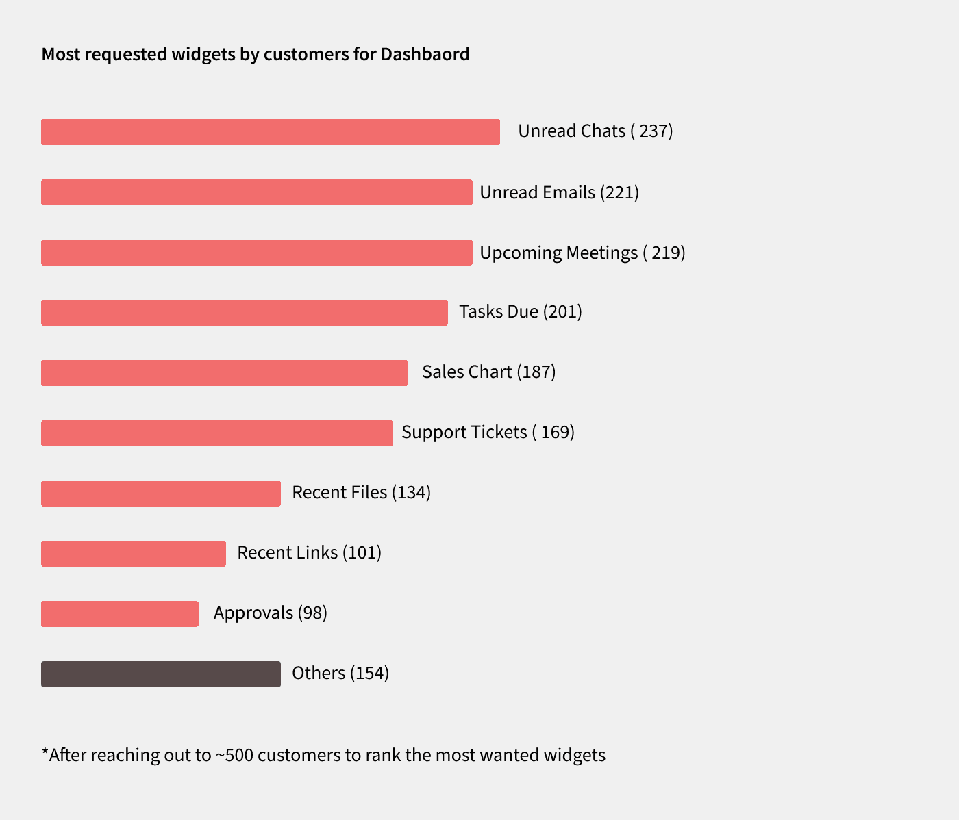
Once the problem statement received consensus, the subsequent step involved determining the solution's direction. To streamline the process, a concise user research effort was initiated to sift through the myriad options presented. The primary aim was to gain insight into the users' expectations regarding the dashboard and how it could maximize their value and productivity. Data from various applications was categorized into groups, and a survey was presented to users, enabling them to select the widgets that would provide them with the most significant benefits. The responses were collected, and the team reached a unanimous agreement based on the findings.
Key findings from user research included:
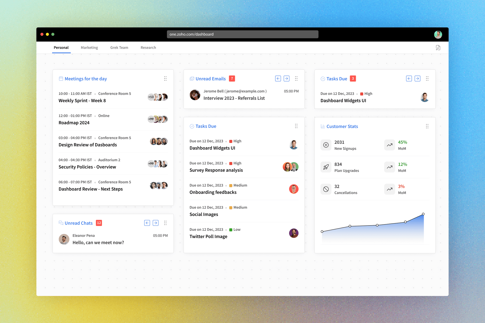
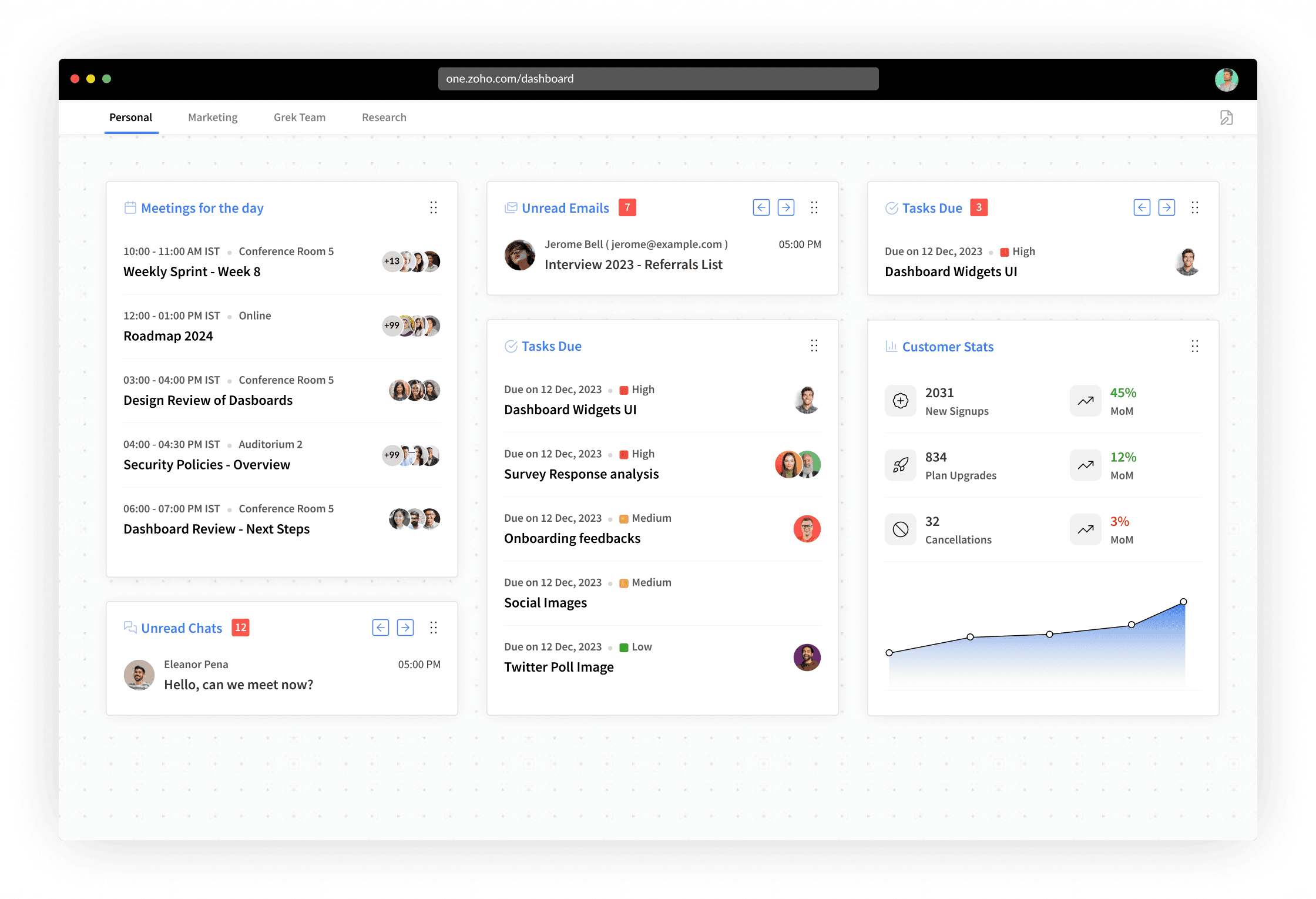
Users needed to see unread emails and chats at a glance.
Quick access to tasks and tickets was crucial for efficient workflow.
An overview of upcoming meetings was highly valued for time management.
UI and Flows
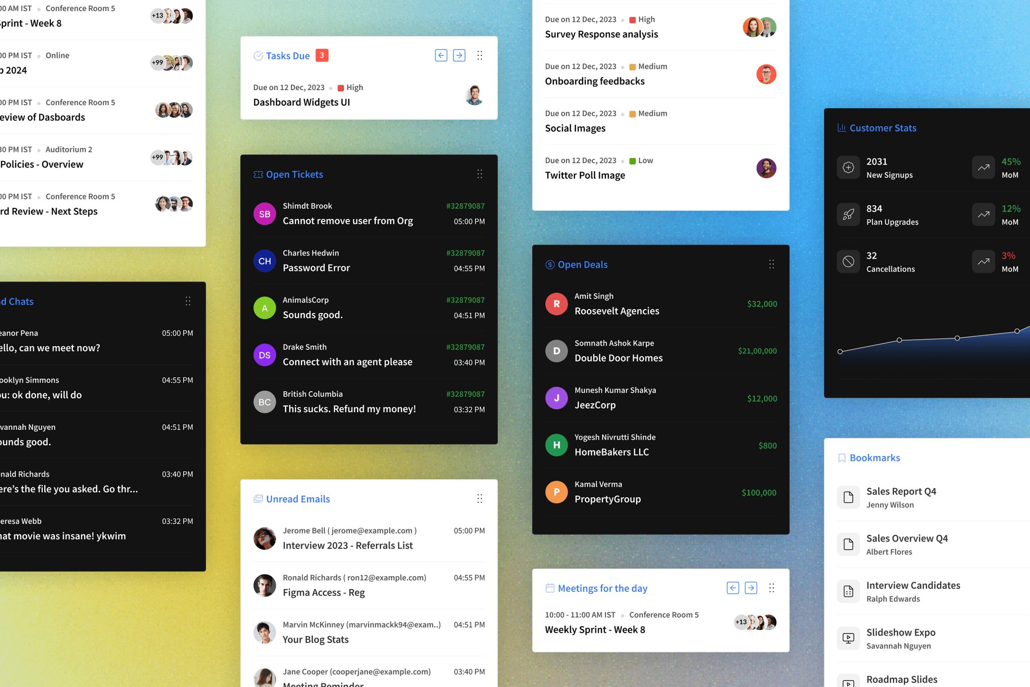
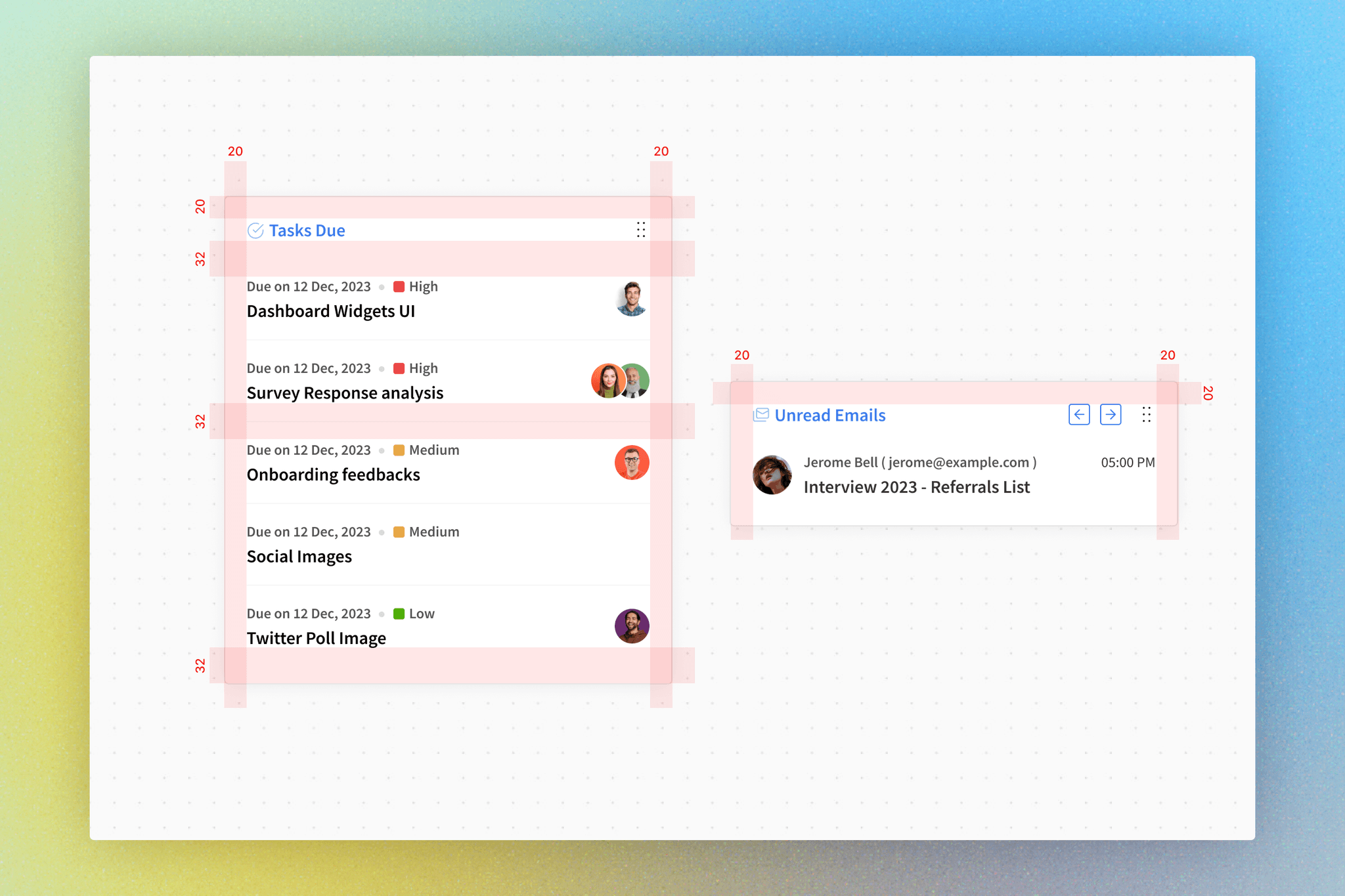
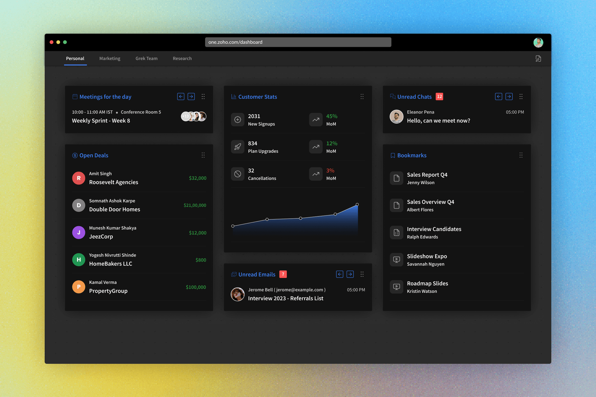
The UI design focused on creating an intuitive and customizable dashboard experience for users. Key components of the UI and flows included:
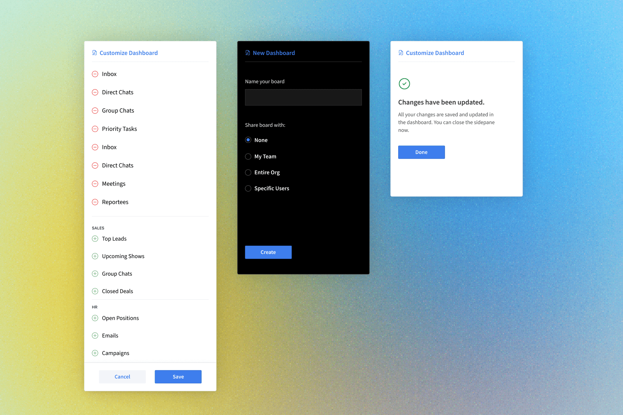
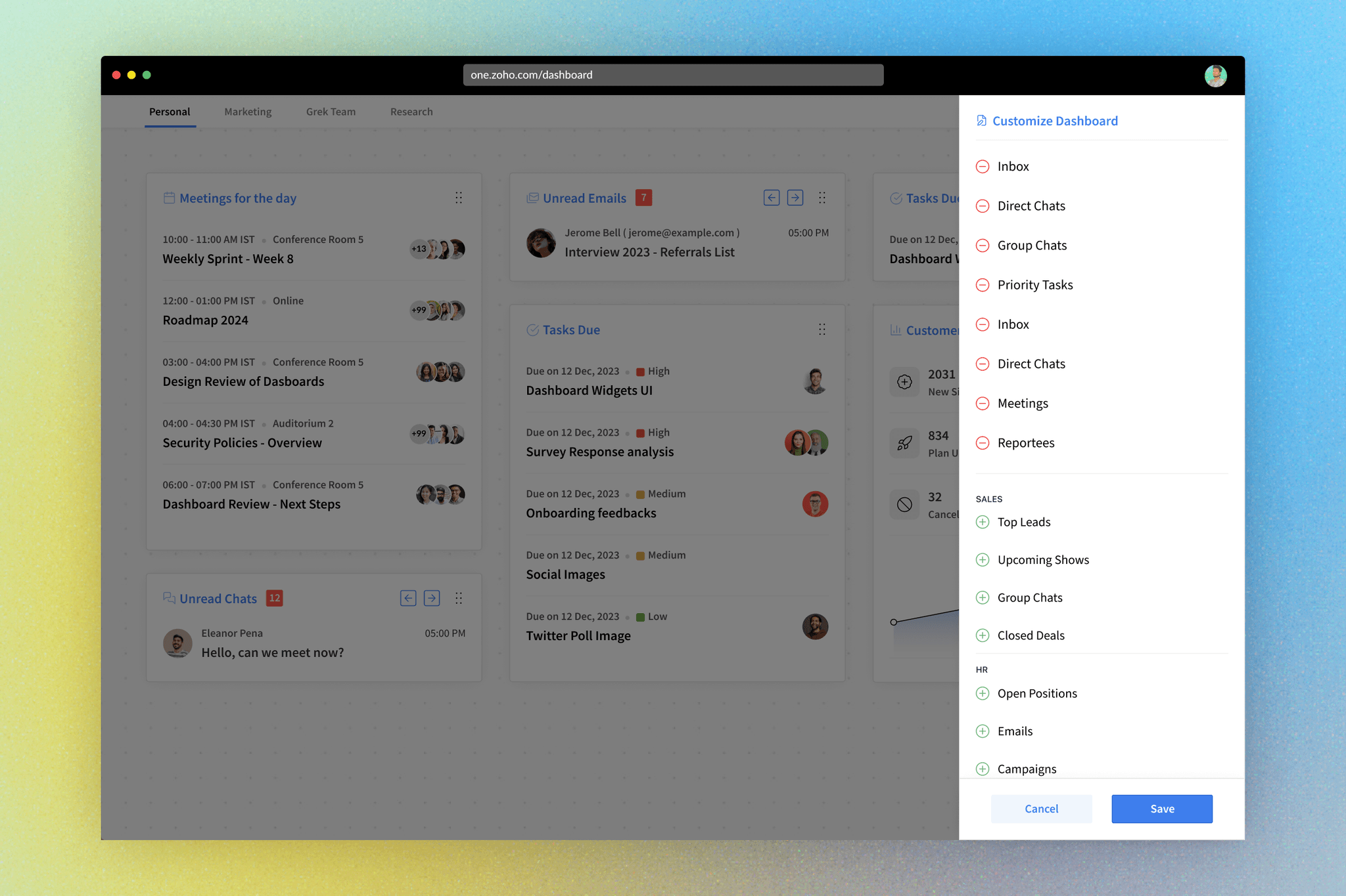
Widget-based dashboard: Users could add, remove, and rearrange widgets based on their priorities.
Widget categories: Widgets were organized into categories such as "Communication," "Tasks," "Meetings," etc., for easy access.
Real-time data updates: The dashboard provided real-time updates for emails, chats, and upcoming meetings, ensuring users always had the latest information at their fingertips.
Additional Enhancements
Additional enhancements were incorporated to improve the overall user experience, including:
Drag-and-drop functionality for widget customization.
Notification settings for each widget.
Option to share the dashboard with other users, groups or the entire org.
Results and Metrics
The implementation of the real-time dashboard yielded significant results:
Higher Adoption: Users quickly adopted the dashboard as their central hub for managing communications and tasks.
Increased Clearance: The dashboard's real-time updates led to higher clearance rates of unread emails and chats, improving overall productivity.
Improved User Satisfaction: Users reported increased satisfaction with the streamlined access to essential information.
2x
Chats & Mails cleared at the start of the day. 30% improvement in tasks & ticket closures
70%
Adoption Rate among users and more than 23% of them created their own dashboards
30%
Of users visited lesser number of apps as they got a quick overview through the dashboard
Feedbacks & Future Scope
Following the successful launch, we embarked on a continuous process of user monitoring and engagement. Multiple sessions were conducted to engage with users, comprehending their needs, and identifying areas for enhancement to elevate the dashboard's functionality. A roadmap was crafted to address these insights, with initiatives such as harnessing AI to provide dashboard summaries, introducing default dashboard layouts tailored to specific industries, and implementing user role detection to suggest relevant widgets. These initiatives are currently in progress, and we're eagerly anticipating their outcomes.
